|
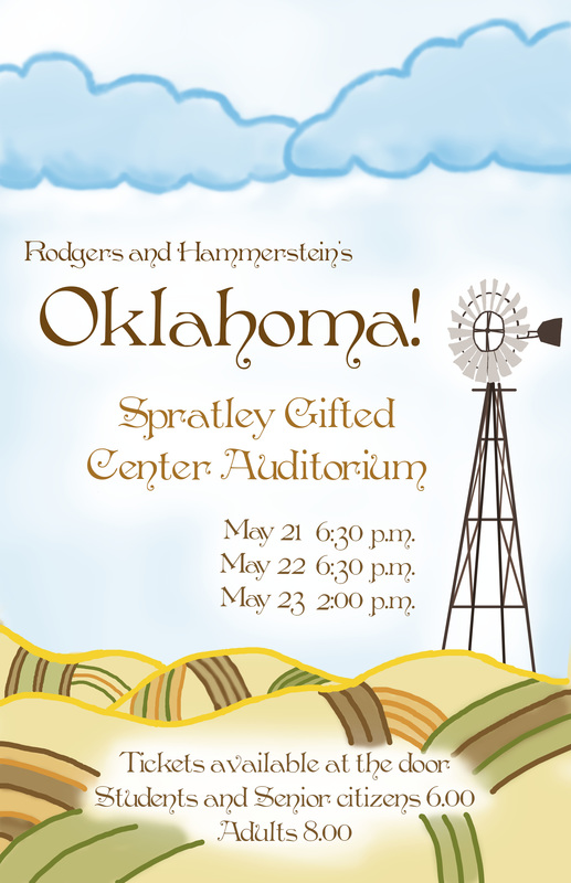
Oklahoma!
I think that the strongest element of art in my poster is color, with the contrast in the ground and sky. The design process on this poster is pretty simple, because it was basically just planning and then drawing it out and picking the font. I feel that I did a good job on my design, but I should have spent more time on the ground. I don't think that having more time would have helped me much with the overall composition. Cartoon Self
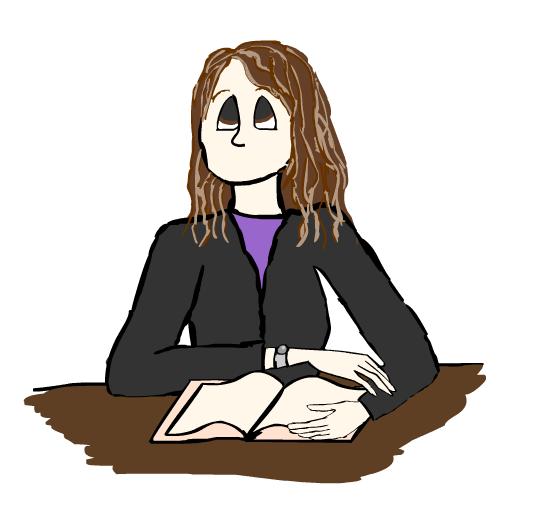
I selected Disney style cartoon because I do not watch cartoons and Disney is one of the few styles I know. Also, Disney has many different variations that I could choose from. I like my finished product, but I wish that I had taken more time on details. I feel that the image represents me very well, with my watch, jacket, and book.
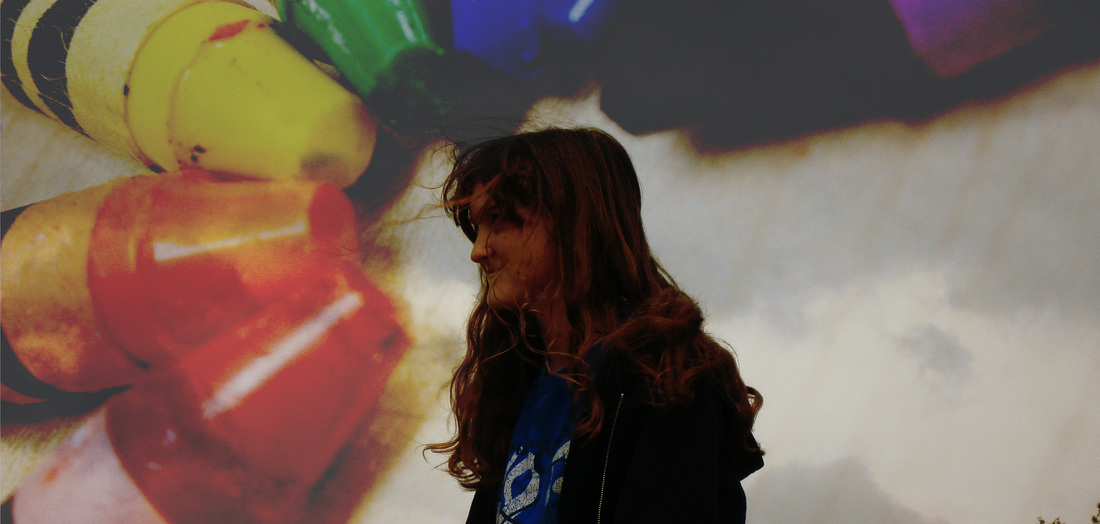
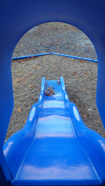
Photo Unit Series I picked these two photos because they convey a sense of emotion. Also, they both have a unique color scheme, which I really like. The techniques used here are Double Exposure and Perspective, and the elements of art are color and perspective.(Double Exposure and color for the top image, Perspective and perspective for the bottom) To create a double exposure in Photoshop, you simply need to put the images on top of each other and then add an affect to the top image. For the perspective photo, you only need to find a place where perspective is very obvious. I might use what I've learned later when I take pictures on vacation.
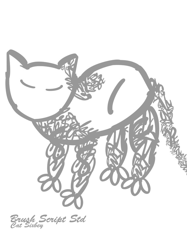
Fontbot
This was probably one of the more challenging projects for me, because I'm more accustomed to using more natural shapes than letters and numbers. The image is pretty simple, and if it came to life it would probably be living in someone's house. A couple main units in this image are the legs and face. I like my color choice because it is very calm compared to my other images. Cat's Montage!
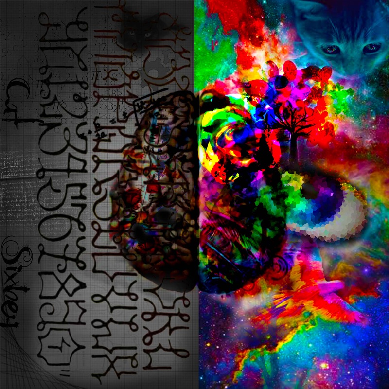
This is the photo montage I made in photoshop CS6. All of the images used in this montage represent me in different ways. For example, the background image of the brain shows the two basic personalities I have, my right brain side and my left brain side (you might know that right brain is creativity, color, etc. and left brain is logic, order, etc.). The remaining photos add the entire idea of the image. On the right side I have several main images. The cat, tree, bird, flower, and eye. These show my different interests and qualities. I love cats, trees/flowers/nature, and many different animals. On the left side I have the same fundamental ideas. There are images showing math problems, technical drawings and words. They show my talent in those areas. The main way that I made this montage was using a low opacity eraser to make the images blend together well. I also used different effects such as pixelate (the eye) and color burn (the flower). The main element used in this image is color(again). First Light
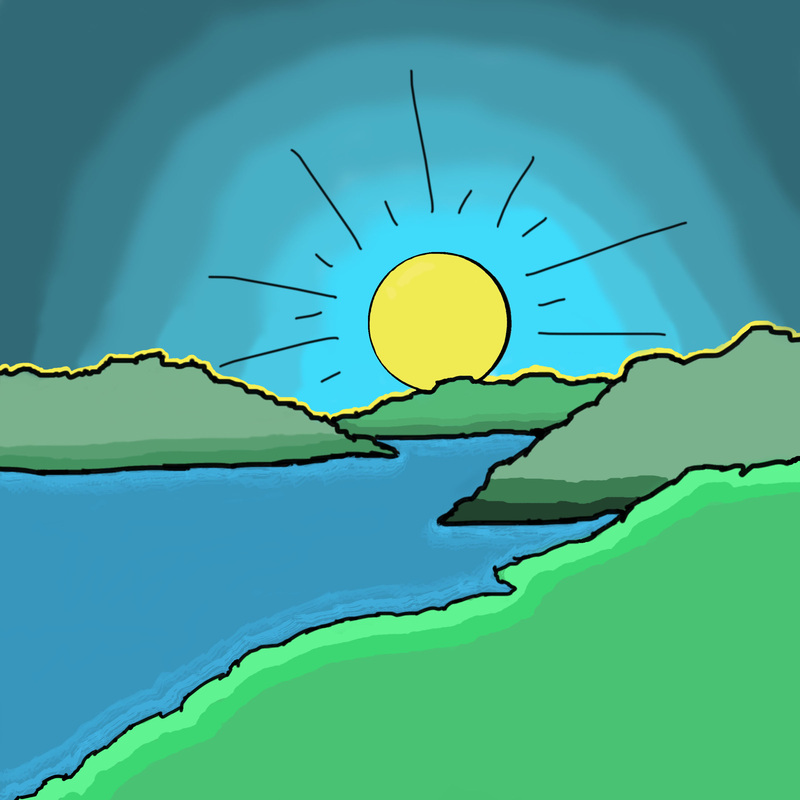
This sunrise is what I chose for my square one art project. I used this because when I saw the line drawing for this, I thought of all of the cool things I could do in color with this image. In class, I used my Bamboo tablet to draw and color this. Bamboo tablets are basically tablets that we can draw on using Bamboo pens, and whatever we draw will show up on the computer screen. This was digitally drawn in Photoshop CS6. I enjoyed using Photoshop and the Bamboo tablets, and I would say that using them was about equal to normal drawing. I think most prominent element of art here is color, because I ran into this as a line drawing and the color in this is only from my imagination, and within this artwork the color is what pops out to me the most. First Post!
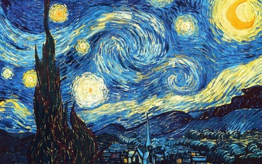
This is a picture of Vincent Van Gogh's Starry Night. I am a big fan of all of his artwork, but Starry Night is definitely my favorite. I love how he uses bold lines to define his artwork. It's also really cool that he's the creator of expressionistic art. |