|
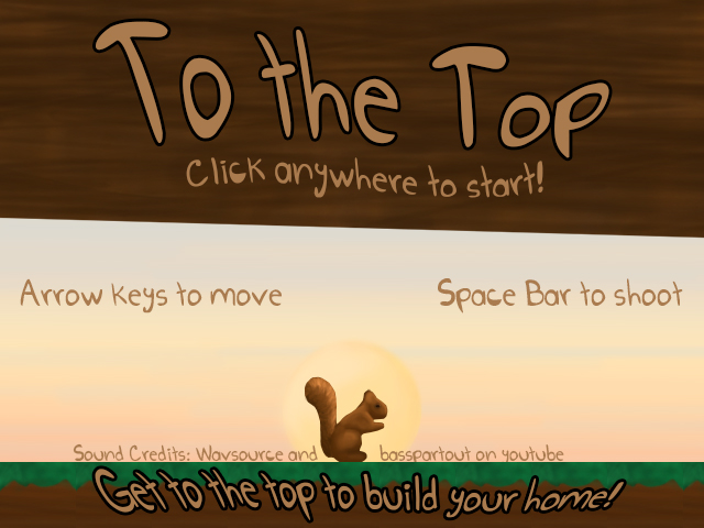
Game Unit: To the Top
My game is about a squirrel who wants to get to the top of a tree. We made our game in game maker, but we started by drawing the images in photoshop. Next, we brought the images into game maker and then added them to sprites and objects and them programmed them. My favorite part of this process was designing and drawing the graphics. If I had more time to work on this project, then I would implement an animation into the game. I enjoyed the game unit, even though it was a lot of work. Phenakistoscope
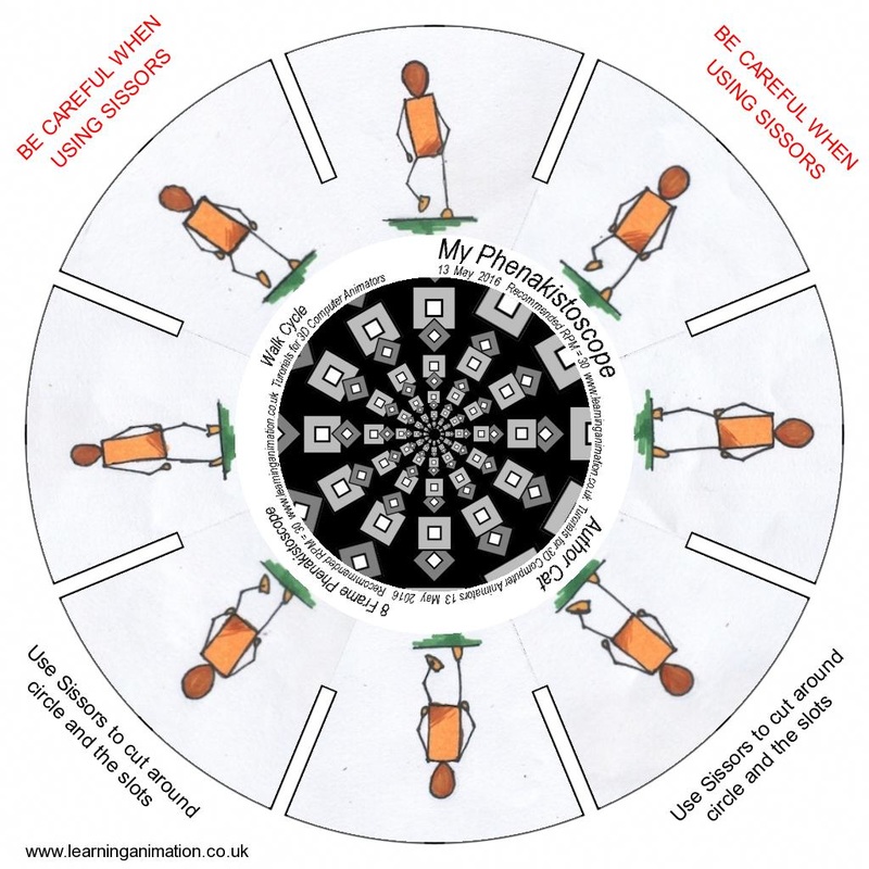
A phenakistoscope is a circular object with drawings on it, and when you spin it, it looks like the images are moving in a loop. Loops are used in animation, and they are an action that happens over and over. My walk cycle is a loop because the separate drawings can blend together to form repetitive motion. Flip books are the most interesting type of old animation to me, because they allow you to have motions that do not repeat, and are simple to make. Making this phenakistoscope was relatively easy, because I only had to find an image online that would guide me, and then "copy" off of it. Color theory
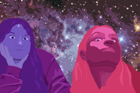
The color theory I used here was analogous, with red-violet, violet, and blue-violet. I think that this theory works well, with how it easily distinguishes between Maia and I. Also, there are elements of all three colors in the background, which ties it together. Photo Unit
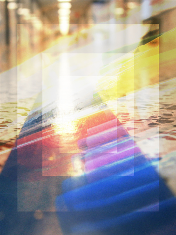
These are my favorite two pictures I made during the photo unit. I like them because I played around with my options in photo shop and came out with something I really like. Also, I love how the colors get more vibrant in both of the pictures, because it makes them stand out even more. Birdkitty
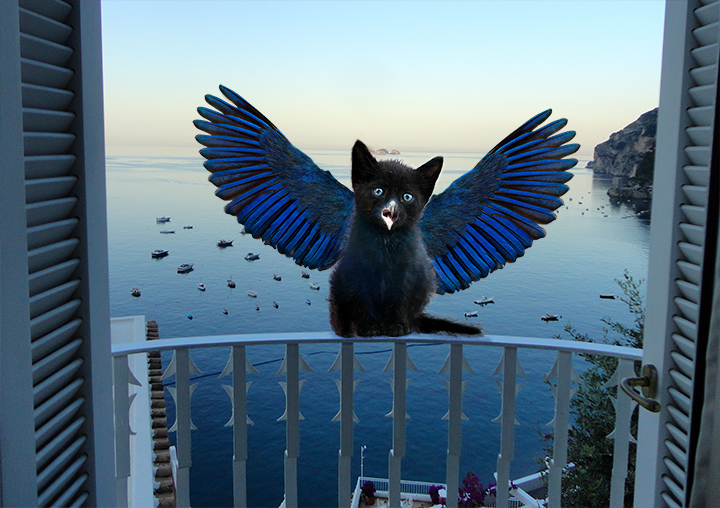
This is the photoshop combination of a kitten and a bird(using various pictures). Mostly, I used an eraser at low opacity, though I also used clone tool and low opacity brush as well. The most used element in the is texture, with the fur, wings, and water, and the most used principle is unity, from how I used blue wings and a blue background, to match with the kitten's eyes. The hardest part of this project was figuring out how to blend the two animals together well, and making sure it looked realistic. Tesselation
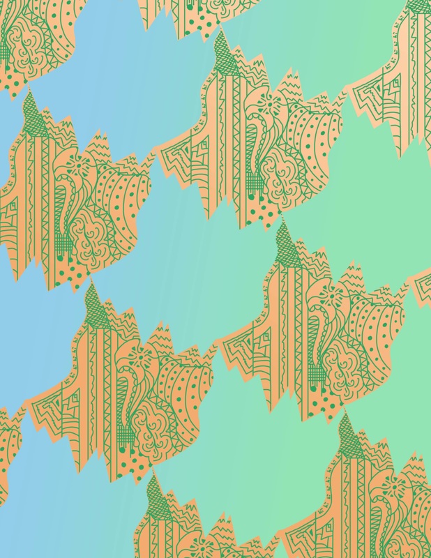
This is my tesselation, which was made in Photoshop. Making this in Photoshop was much easier than by hand, because it was easy to cut and paste the shape and zen tangle. I think the strongest element is line, because of the zen tangle, and the strongest principle is pattern, because of the blocked out shapes. The original idea comes from MC Escher, who makes really cool, really complicated tesselations. FontBot
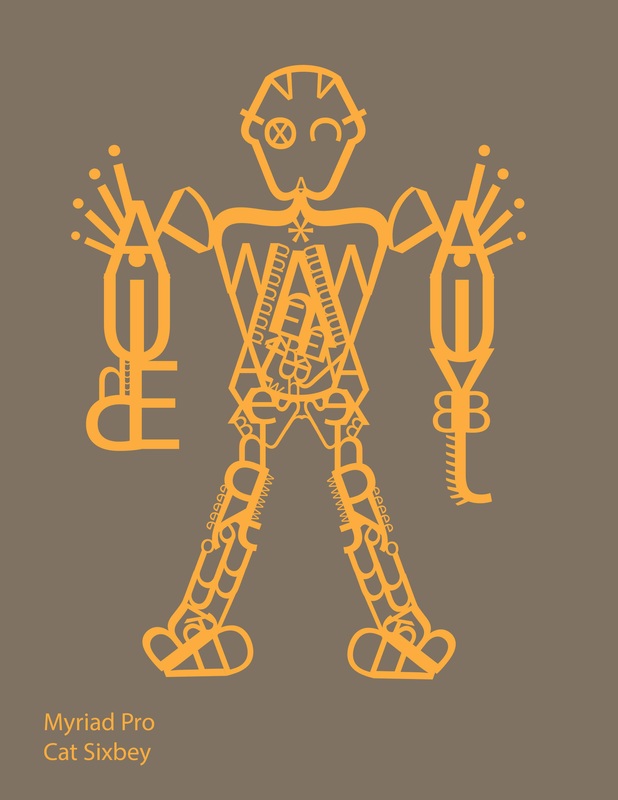
This is my fontbot, made with the font Myriad Pro. I feel that my font matches the bot very well, because I used the blockiness of the font to create a very blocked bot. The process that I used to make it was enjoyable, and I never got bored of working on him, or got stuck on one part for over ten minutes. Myriad Pro is a Sans Serif font, meaning that it does not have serifs, which are basically extra curly bits. I think that my fonbot would most likely be a peaceful protector of something or someone. Also, he would most likely be a very quiet and calm person, only using violence when absolutely needed. Square 1 Art Project
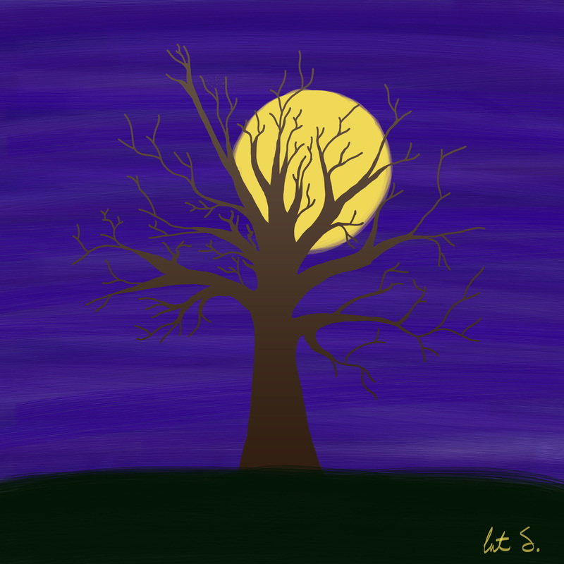
This is my high contrast project, which I created using Photoshop and Bamboo tablet. The bamboo tablet is fun to use, because I can draw like I normally do, but on the computer. I started by drawing out my tree, then filling it with a small gradient. Then, I worked on the background, layering purples and blues, and then adding the moon. Last, I found a dark green to put for the ground. The most prominent element in this is color, because I had to find colors that all fit together well. The most prominent principle in this is unity, because it was hard to unify the colors so they worked well. The contrast in this painting is mostly shown by the moon behind the tree, and the sky and the moon. Cool Art!
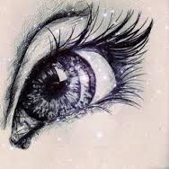
I like this art because of the artist's subtle use of color in and around the eye. Also, the combination of the cool colors makes the drawing look like something you would see outside in the snow. The artist also gives you a smooth combination of dark and light lines, using them to bring this drawing to life. I got this off of the Google, which said it was from Pinterest. |
These are my portfolio posts from the previous year. Click on the button to see them!
